If you’re looking for a web designer, or having a go at making your own website then you may have heard the term “responsive” being thrown around. But what does it mean in the context of web design? And is it really that important? In this article I’ll answer everything you need to know.
What is a Responsive Website?
“Responsiveness” in terms of web design essentially means the site is able to adapt to work on any device e.g. desktop, laptop, tablet or mobile.
This means the website can:
- Respond to different screen sizes. For example, both the aspect ratio and overall screen size is different on a laptop compared to a mobile. A responsive website will shift the layout and features in order to work on both devices.
- Be interacted with on any platform. The website will be easy to navigate and scroll through, and clickable elements will work regardless of the device.

Here are some key examples of responsive web design.
Menu and Navigation
It is common for the desktop version of a website to have a menu which spans across the top of the page and gives the user access to other areas of the website.
This is possible because desktops have a wide horizontal screen layout. On mobile devices, the screen has a narrower vertical screen layout, so a spanning menu across the top would look cramped and be difficult to use.
To combat this, responsive websites often have a “hamburger menu” at the top which can be tapped on causing it to expand and show the full menu.
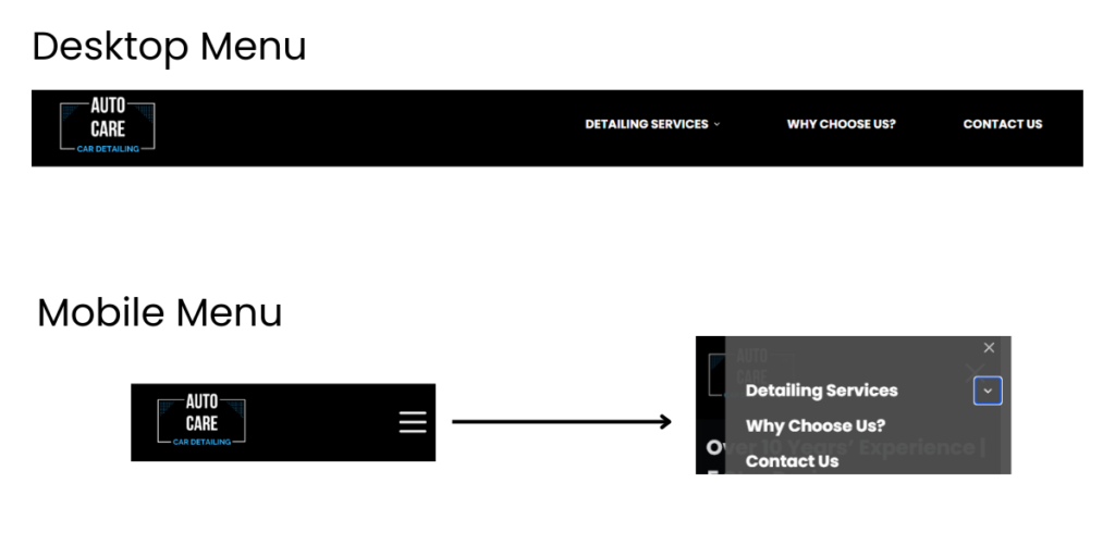
Image and Text Size
Again, in order to respond to the screen size a website much scale the images and text accordingly to suit different devices. This ensures that the elements still fit comfortably on the page without the user having to scroll sideways to view it fully. A responsive website should be able to automatically adjust the size of any element to suit desktop, laptop, tablet and mobile screens.
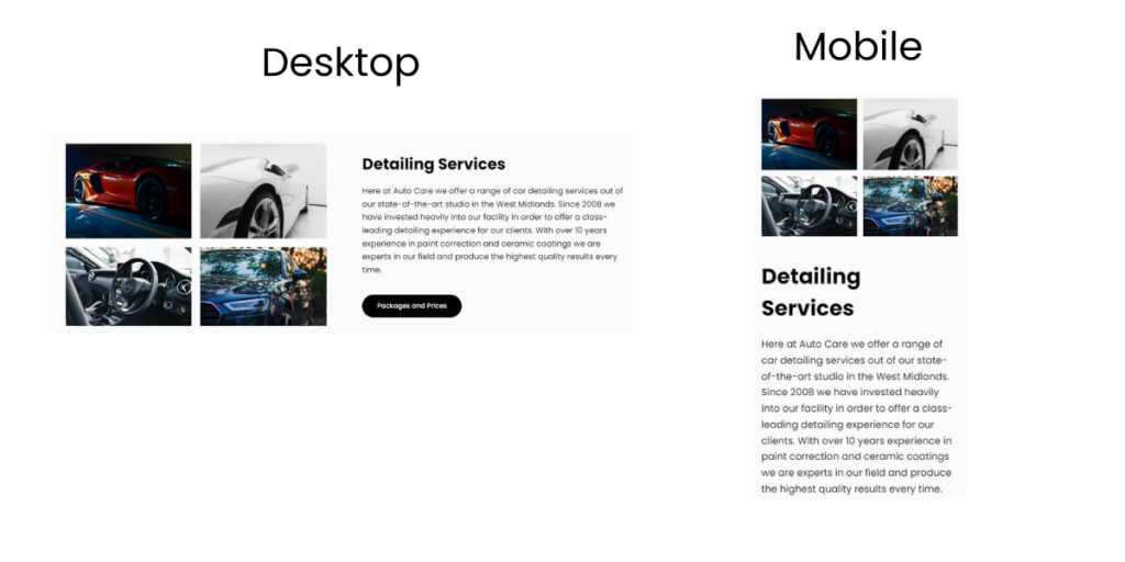
Layout Shifting
To switch from a horizontal desktop screen to a vertical mobile screen, the website layout must shift. This ensures that all elements are still viewable. The most common way to do this involves stacking elements on mobile devices. Notice in the example below how the left-right image and text columns on the desktop version are stacked vertically on the mobile version of the website.
Page Loading Time
Having a responsive website also means that it loads quickly on every device. If the website is not responsive, then it will usually take much longer to load on mobile devices, particularly compared to desktops. Responsive web design not only affects how a website looks, but also how quickly it works.
Why is Having a Responsive Website Important?
Since most people design websites on a desktop computer with a nice big screen, it can be easy to neglect the importance of the website being responsive however it is vitally important not to overlook it. Here’s why.
It Means Everyone Can Use Your Website
According to searchengineland.com
- 57% of internet searches are on mobile and tablet devices
- 43% of internet searches are on desktops or laptops
The split is reasonably even at the moment, meaning that if you only make your website functional on one type of device then it will only work for half of your visitors.
Mobile traffic is growing too, so it’s important not to neglect it. In 2023, 57% of searches have been on mobile or tablet devices, whereas in 2012 this figure was only 11% showing how much has changed in the past decade.
In order to give your visitors the best user-experience, it is vital that your website works on every device.
It Helps With SEO
SEO stands for “search engine optimisation”. It refers to how well a website ranks in search engines such as Google and Bing.
Responsive websites are also far more likely to rank higher. This is because Google actually prioritises “mobile-first” websites, so if your website does not work well on a small screen it will be sent further down the rankings.
This also works indirectly. Another one of Google’s ranking factors is user-experience where it analyses metrics such as how long the viewer spent on the page, and whether they interacted with the website and viewed other pages.
If a website is not responsive and mobile-users happen to visit it, then they will likely click away pretty quickly and not interact with it. This sends bad signals to Google and will cause the ranking position to drop.
It Makes it Easy to Share the Website on Social Media
Your website shouldn’t just function as a way for new customers to find you from Google, but it should also serve as a place to direct potential customers from social media to find out more about you.
For example, you may have an Instagram page which gets a lot of reach but the platform doesn’t allow you to share everything that people need to know about your business.
The best thing you can do here is to direct your Instagram audience to your website to learn more. Since most social media platforms e.g. Instagram, Tik Tok and Facebook are used on mobile devices (rather than desktops or laptops), you need to ensure that you are directing your audience to a website which still looks great on a mobile device. Otherwise, you won’t be leveraging the platform effectively.
How Do I Make My Website Responsive?
If your website is not responsive then you really need to look at the platform you used to design it. There’s not really a one-size-fits-all answer here because it completely depends on the way the website was built.
I use WordPress to build and design all my client’s websites and choose a responsive theme to ensure it works perfectly on every device. I also extensively check each website I build on a variety of different devices and screen sizes to ensure it maintains a good user experience.
Need Help With Your Website?
Media Bright specialises in web design, SEO and website content. Head over to my service page for more information or get in touch using the contact form below.